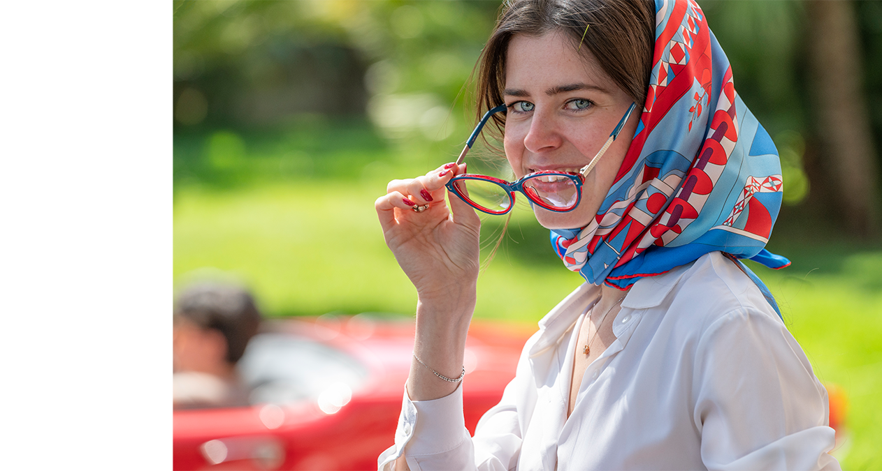
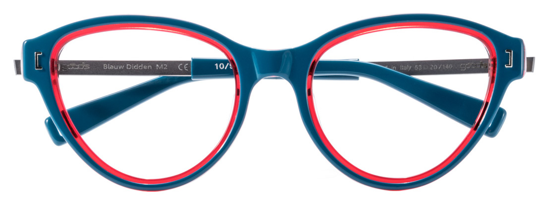
Blauw Didden
We want to surprise people, for us architecture is not something static or historical. We don’t want to look back, but rather fantasize about the future.
Nathalie De Vries (studio MVRDV)
ARCHITECT
Nathalie De Vries
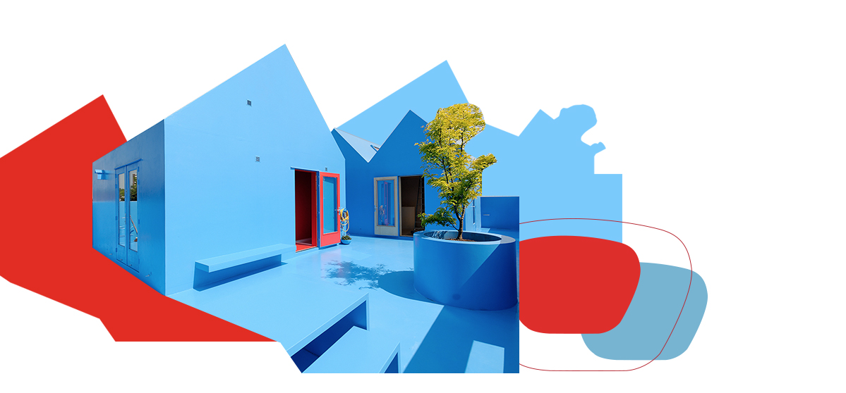
The color comes from the Didden Village building extension project, carried out in 2006 in Rotterdam by the Dutch studio MVRDV, which uses the color blue in a symbolic, experimental and provocative way.
-
 EYE
EYE
-
 BRIDGE
-
 TEMPLES
OUT OF STOCK
BACK TO STOCK
Colore Lenti
Lens Color
Seleziona il colore delle lenti.
Select the desired color.
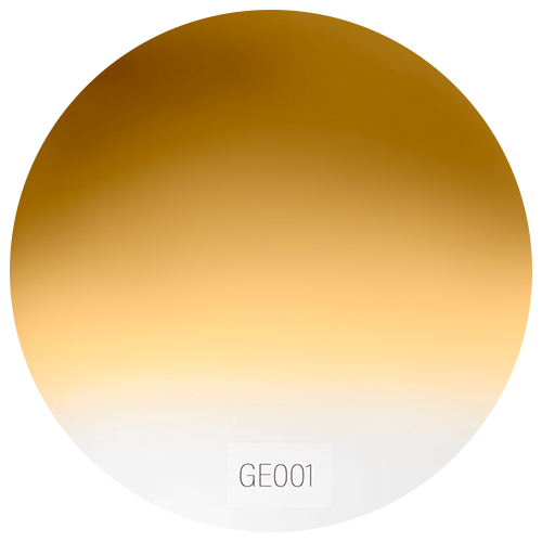 GE001
GE001- GE001
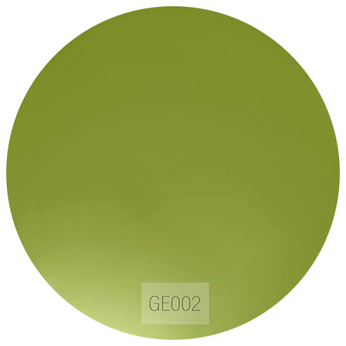 GE002
GE002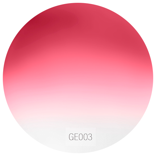 GE003
GE003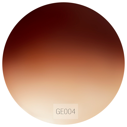 GE004
GE004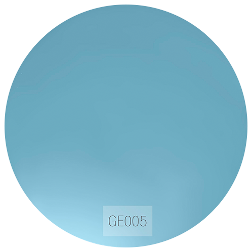 GE005
GE005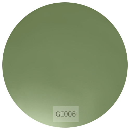 GE006
GE006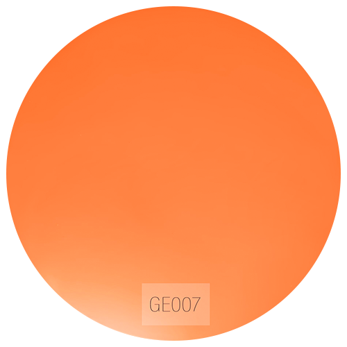 GE007
GE007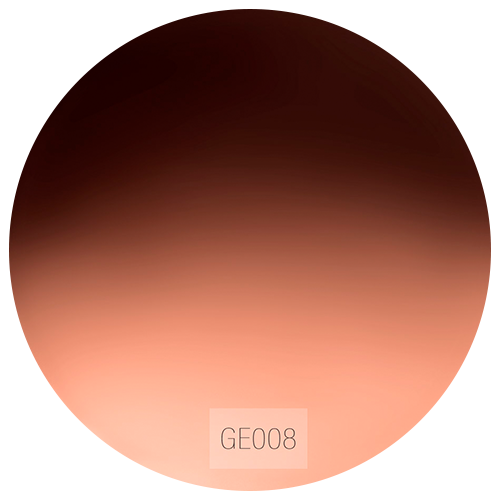 GE008
GE008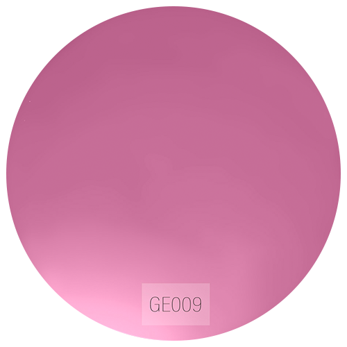 GE009
GE009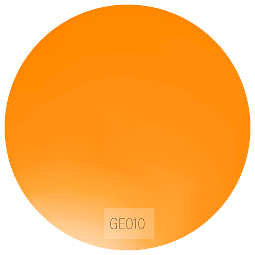 GE010
GE010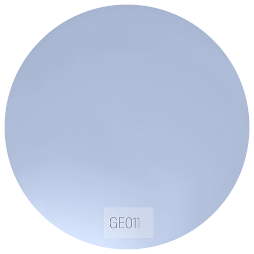 GE011
GE011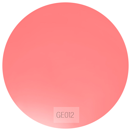 GE012
GE012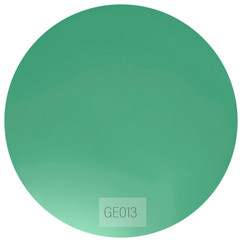 GE013
GE013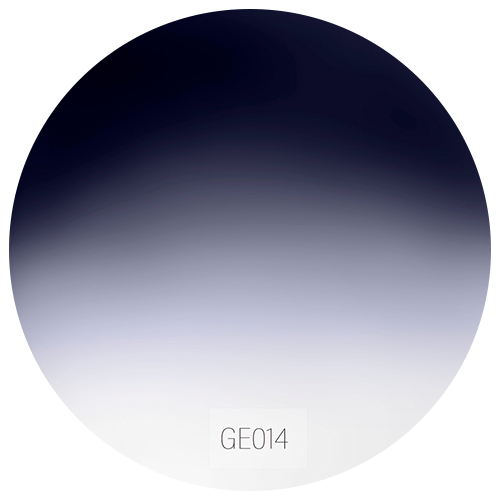 GE014
GE014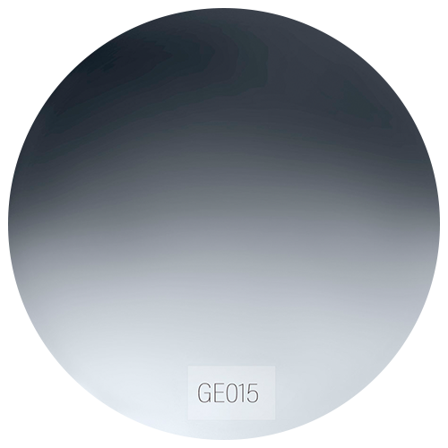 GE015
GE015
Montatura
Frames
Seleziona la montatura desiderata.
Select the desired frame.
-
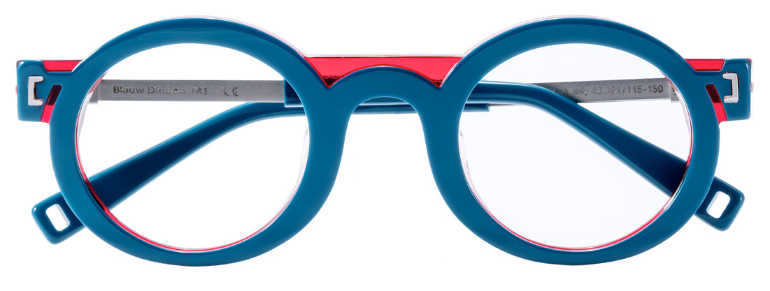
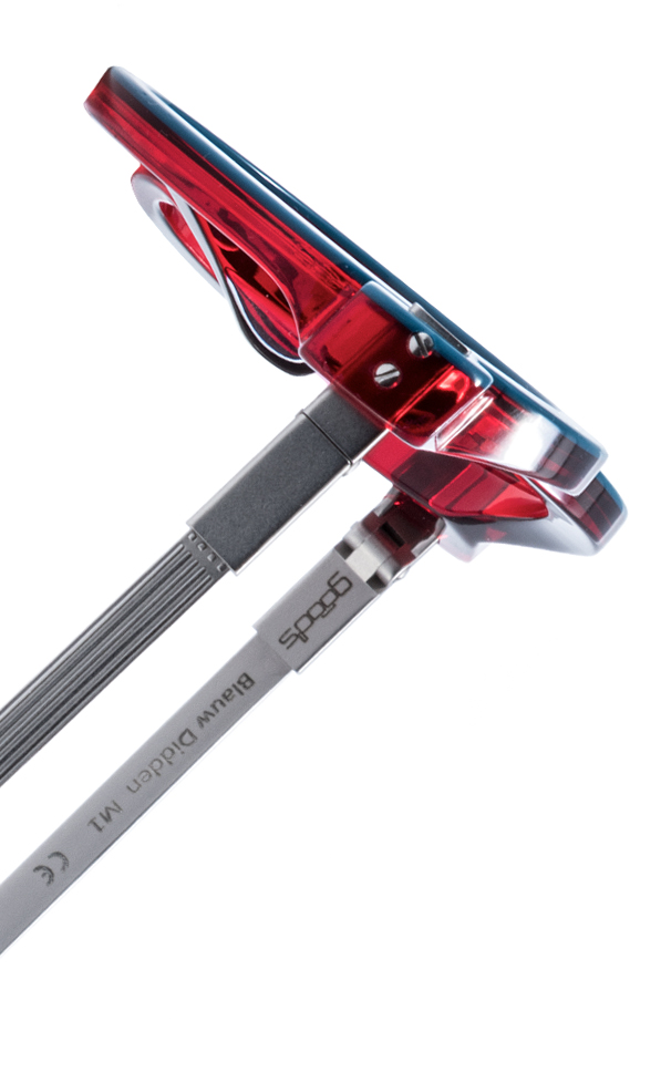
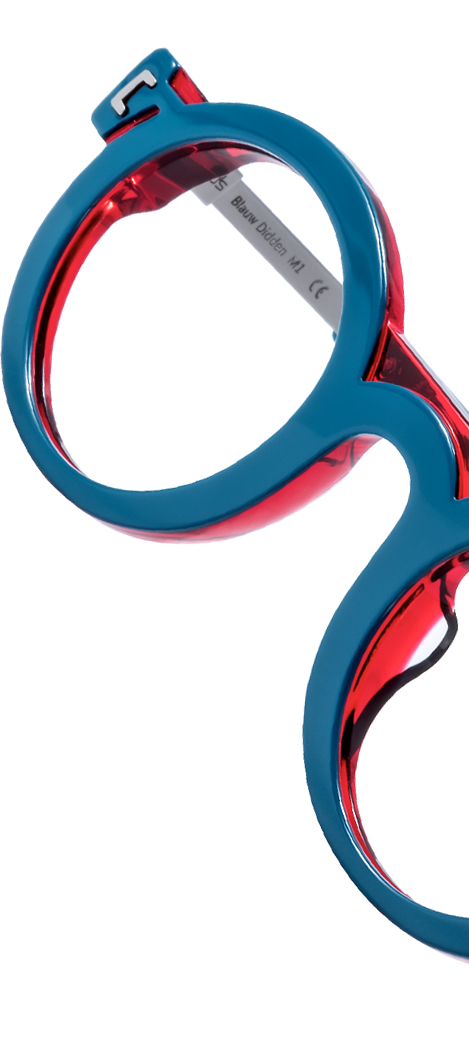
M1
Sky blue/ Crystal Traffic RedSilver Soul
-
M2
Sky blue/ Crystal Traffic RedSilver Soul
-
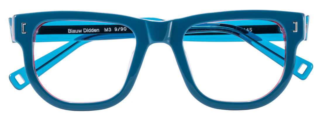
M3
Sky blue/ Crystal Traffic RedSilver Soul
-
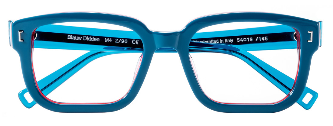
M4
Sky blue/ Crystal Traffic RedSilver Soul