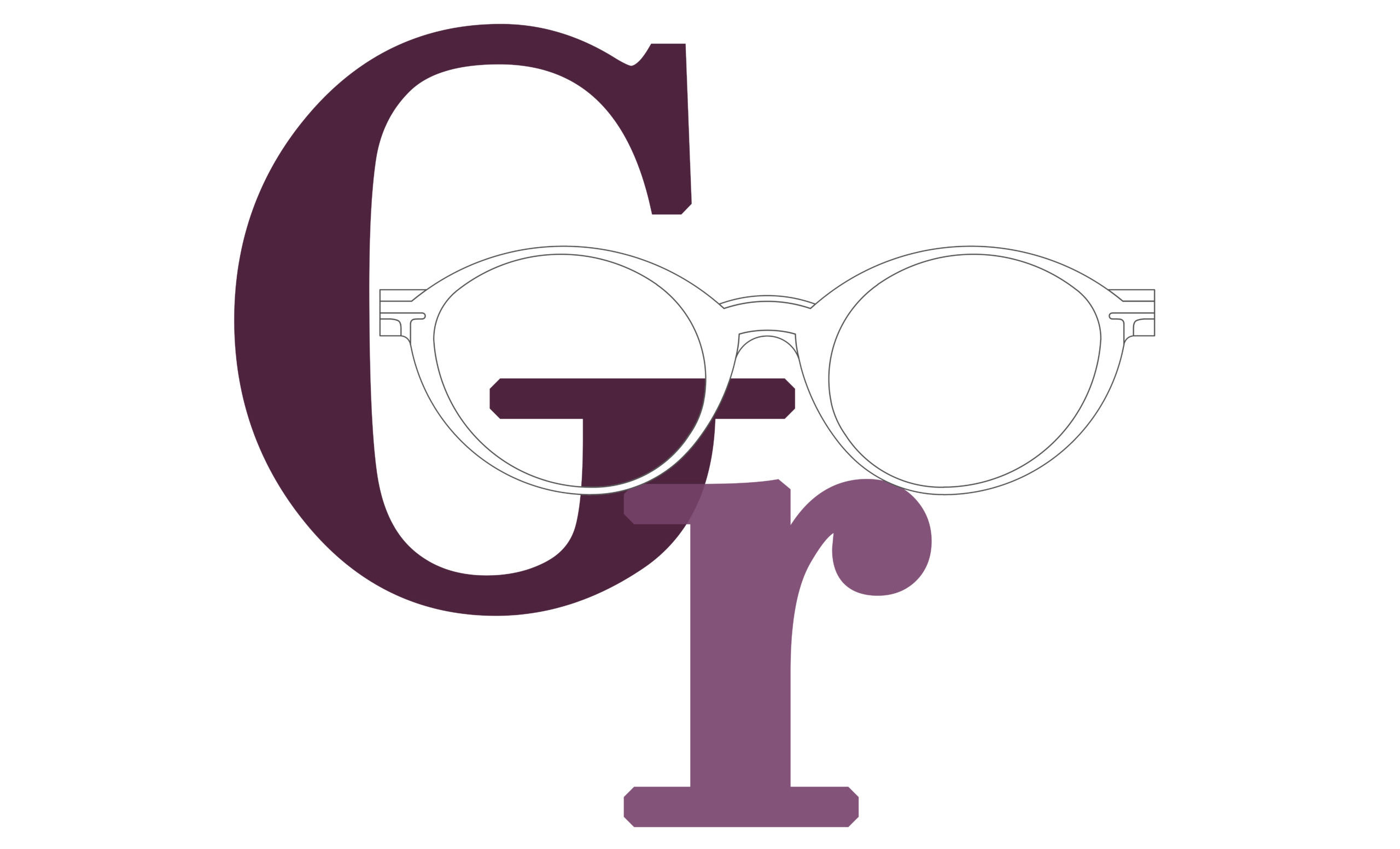
Garamond
I learned things about serif and sans serif typefaces, variable spaces between letters, and what makes a great typeface great. It was subtly beautiful, historically and artistically, in a way that science cannot capture, and I found it fascinating. None of this had the slightest hope of practical application in my life. But ten years later, when we were designing the first Macintosh computer, all of that came back to me
Steve Jobs (1955 – 2011)
ENTREPRENEUR AND INVENTOR
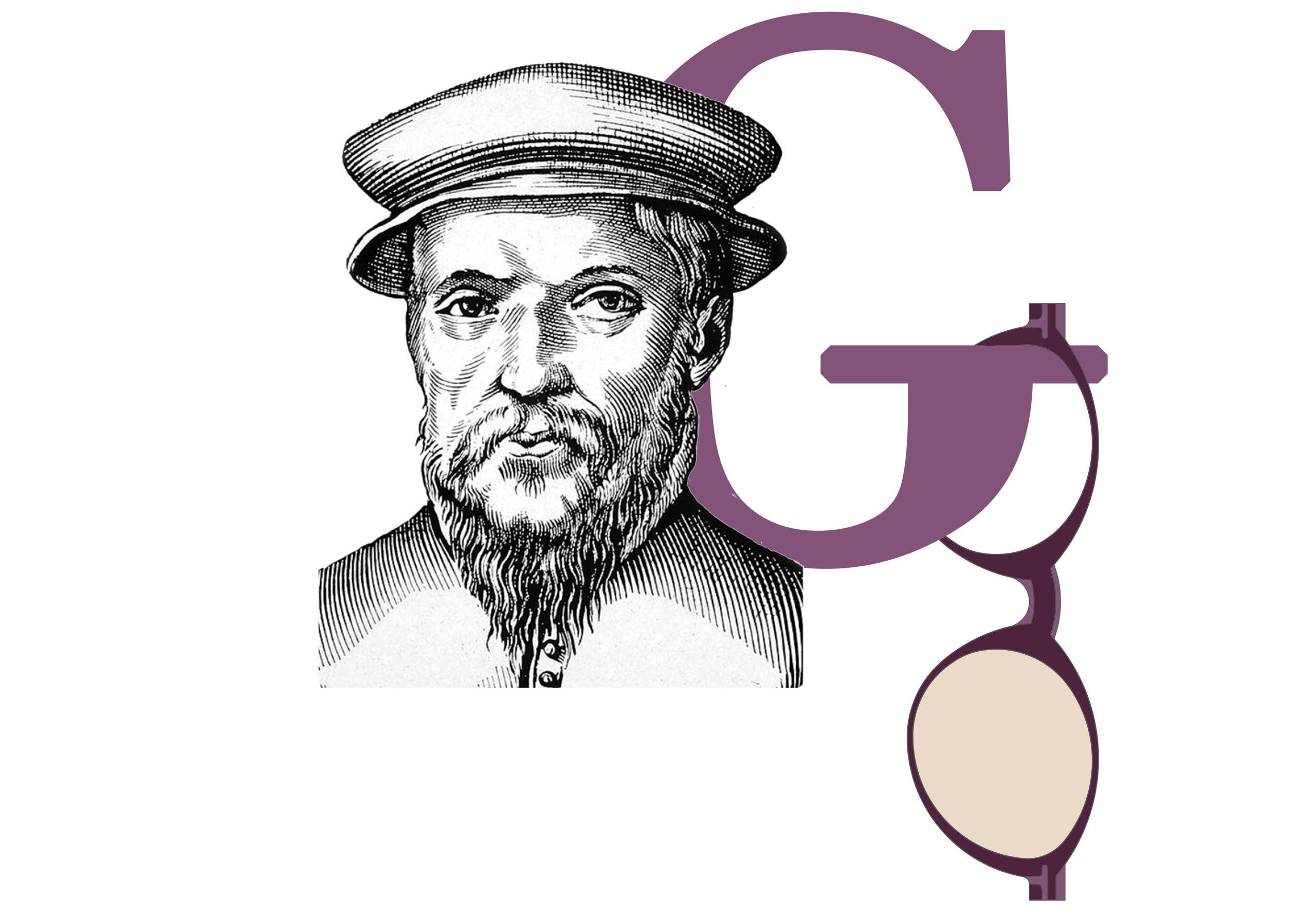
Anima Linotype
visible from the outside due to the subtle transparency of the acetate and made to an exclusive Good’s design, it reproduces - with an engraved inscription - the right way to look at things developed from right to left, like the lead lines produced by the traditional Linotype typographic machine, invented in 1886 and defined by Thomas Edison as The Eighth Wonder of the World.
-
 EYE
49 mm
EYE
49 mm
-
 BRIDGE
19 mm
BRIDGE
19 mm
-
 TEMPLE
145 mm
TEMPLE
145 mm
Colore Lenti
Lens Color
Seleziona il colore delle lenti.
Select the desired color.
 GE001
GE001- GE001
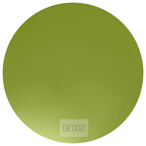 GE002
GE002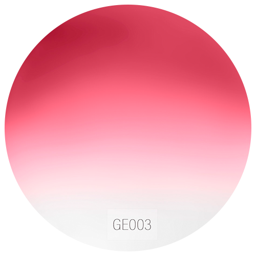 GE003
GE003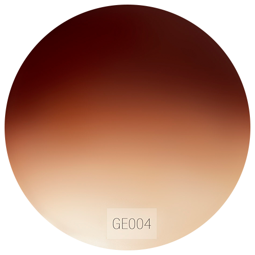 GE004
GE004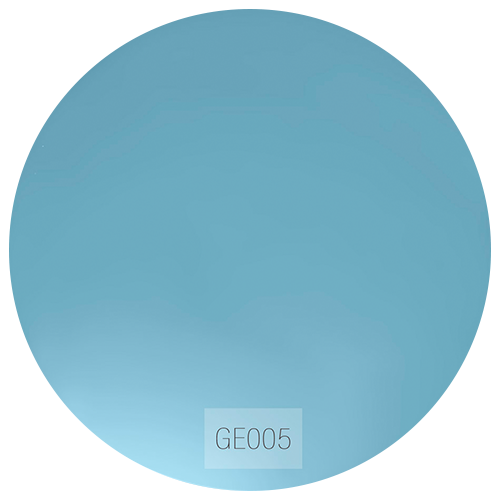 GE005
GE005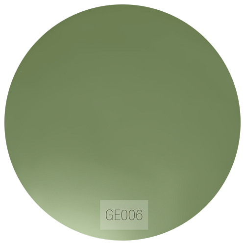 GE006
GE006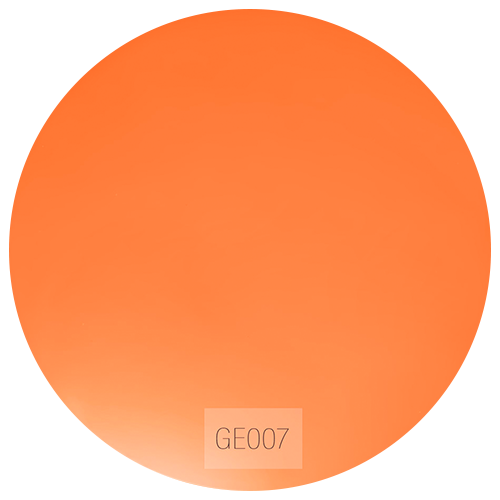 GE007
GE007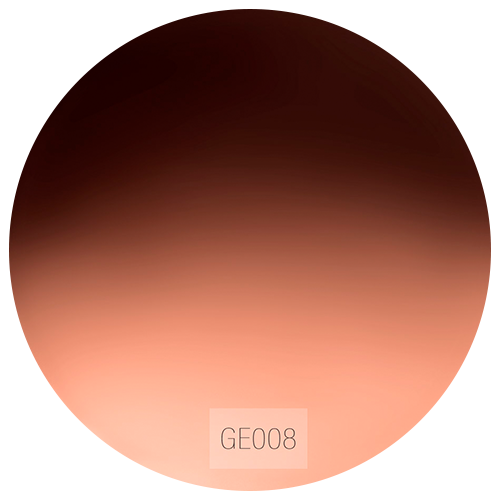 GE008
GE008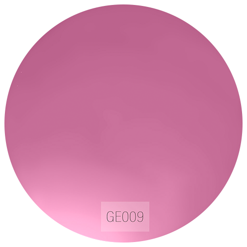 GE009
GE009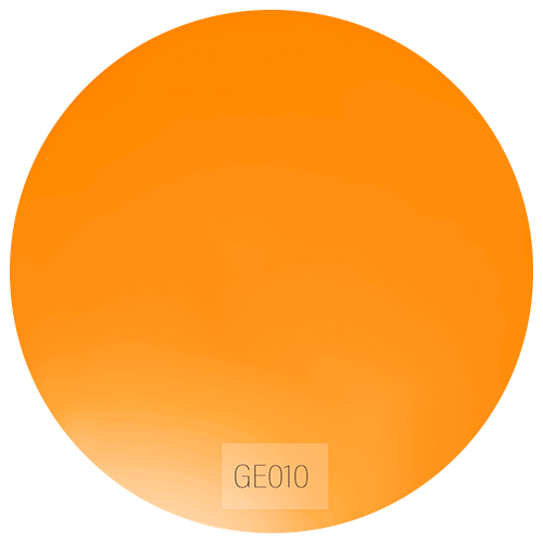 GE010
GE010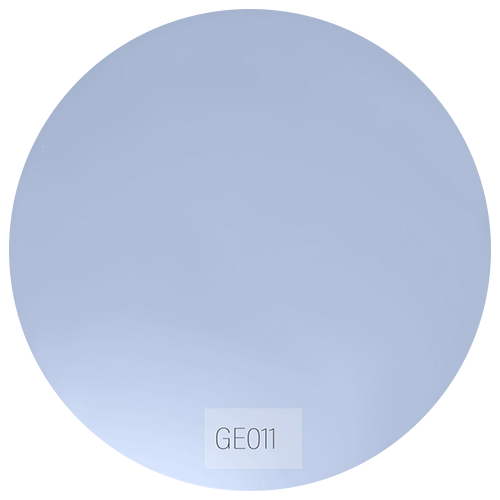 GE011
GE011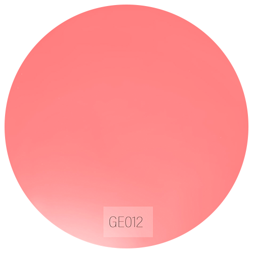 GE012
GE012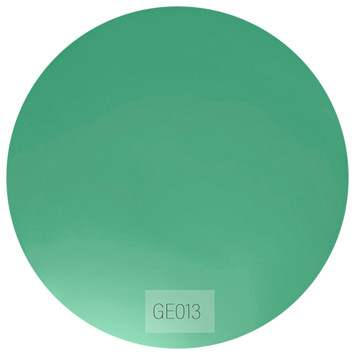 GE013
GE013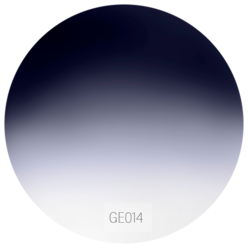 GE014
GE014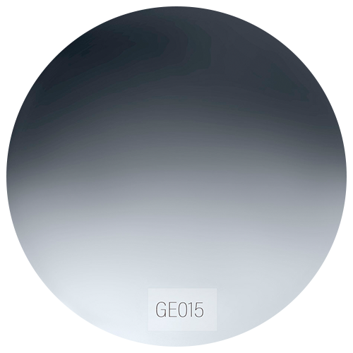 GE015
GE015
Montatura
Frames
Seleziona la montatura desiderata.
Select the desired frame.
-
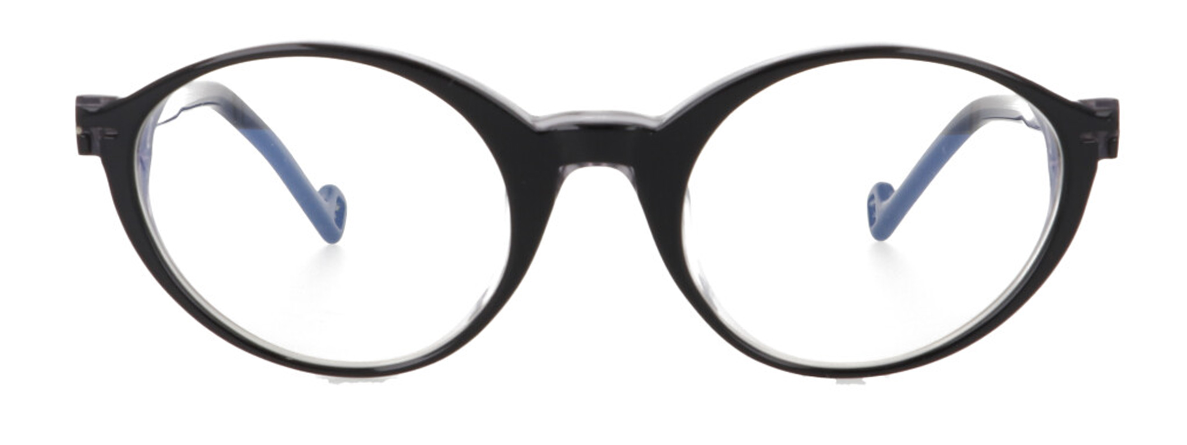
Garamond C1
NerofumoSilver Soul
-
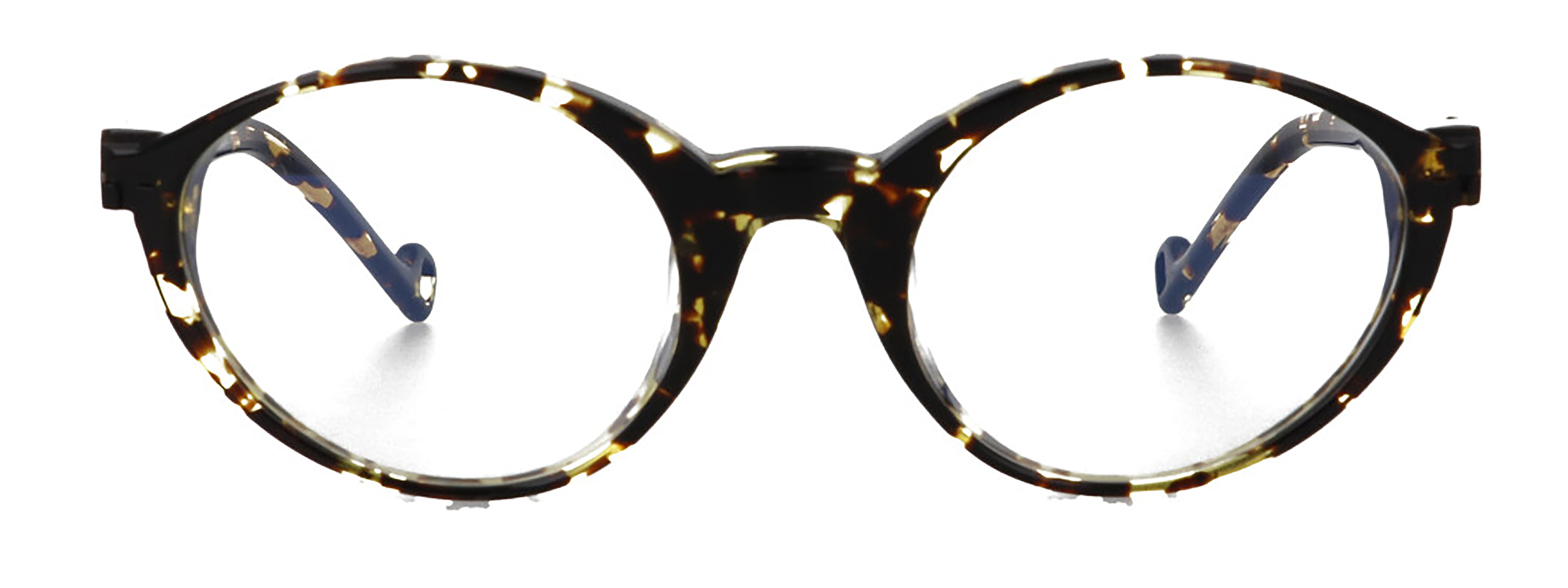
Garamond C2
CalligraphyGolden Soul
-

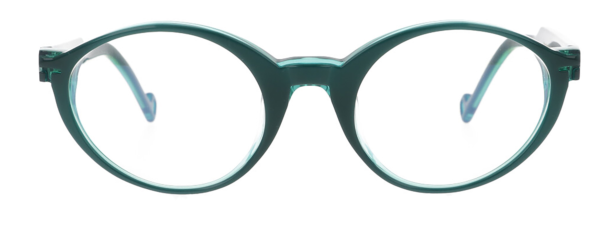
Garamond C3
AzuriteSilver Soul
-
Garamond C4
MalachiteGolden Soul
-
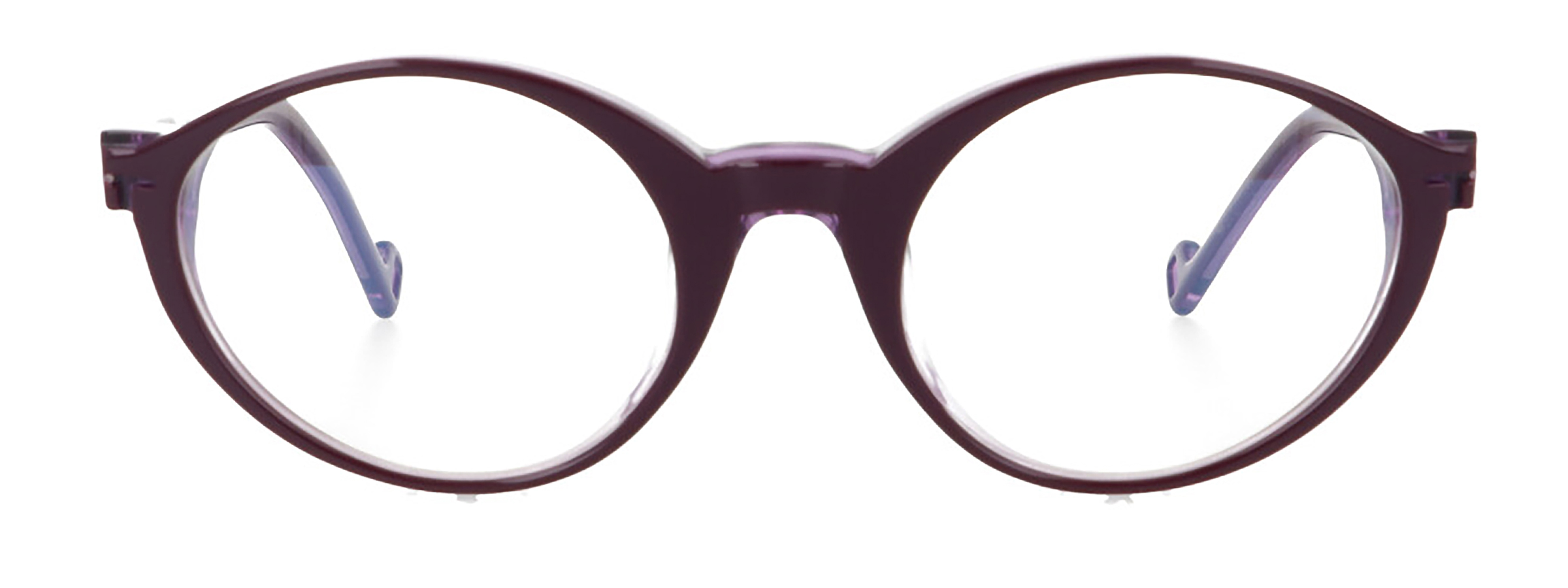
Garamond C5
ChrozophoraSilver Soul
-
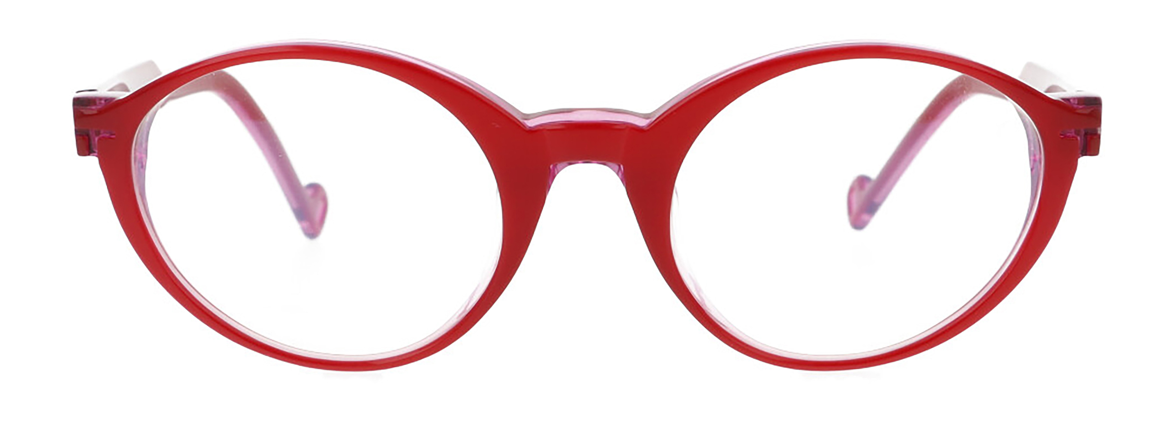
Garamond C6
Vermillion/ OrceinSilver Soul
-
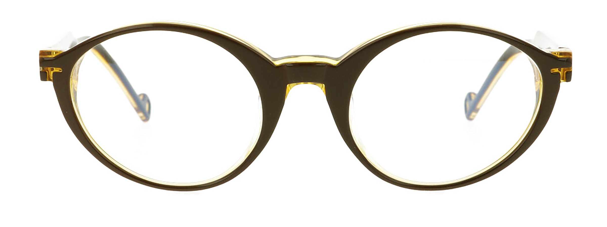
Garamond C7
Burnt Umber/ OrpimentGolden Soul