
Helvetica
The Beatles are the Helvetica of pop, just as Helvetica is the Beatles of typefaces
Experimental Jetset
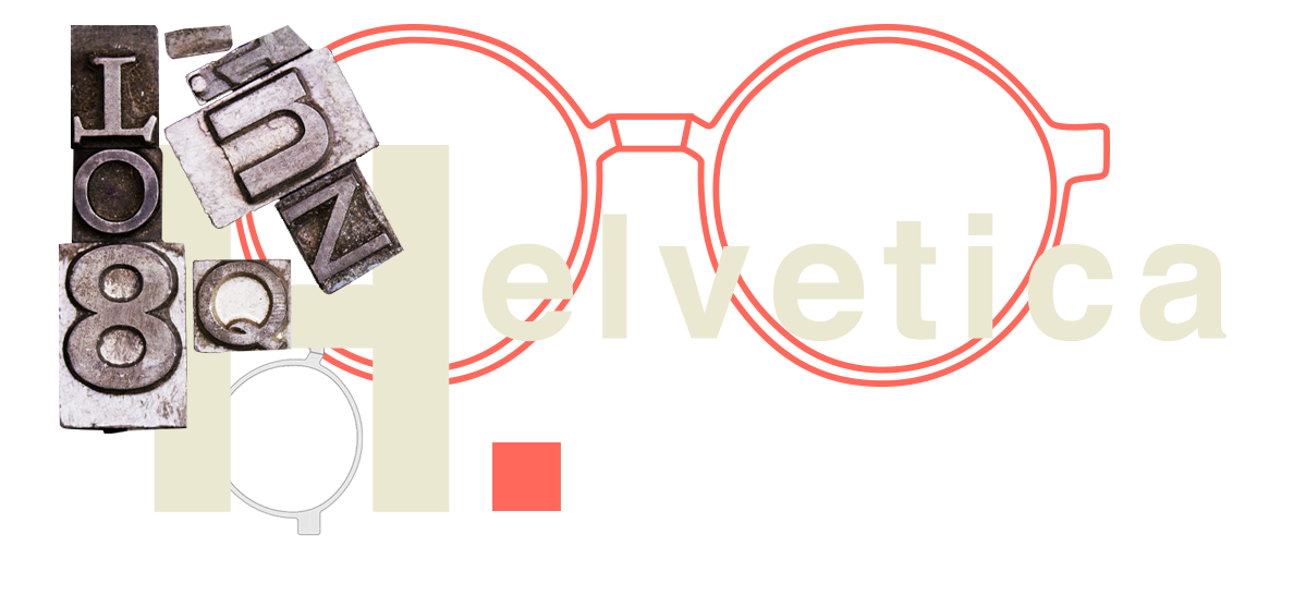
Anima Linotype
Visible from the outside due to the subtle transparency of the acetate and made to an exclusive Good’s design, it reproduces - with an engraved inscription - the right way to look at things developed from right to left, like the lead lines produced by the traditional Linotype typographic machine, invented in 1886 and defined by Thomas Edison as The Eighth Wonder of the World.
OUT OF STOCK
BACK TO STOCK
Colore Lenti
Lens Color
Seleziona il colore delle lenti.
Select the desired color.
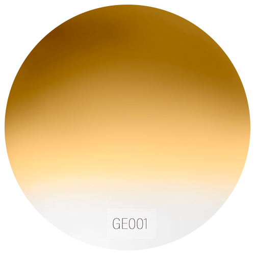 GE001
GE001- GE001
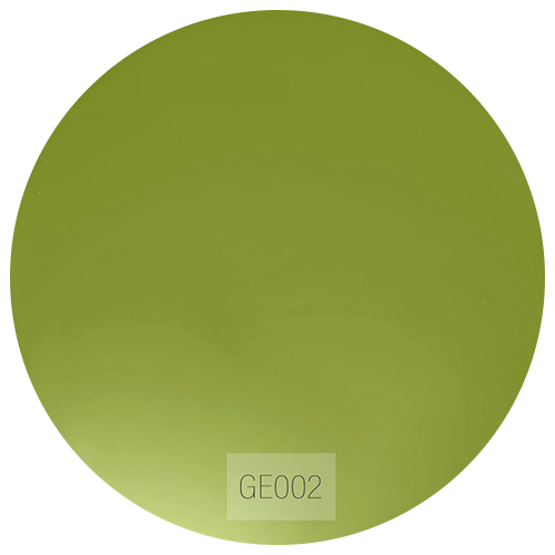 GE002
GE002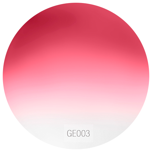 GE003
GE003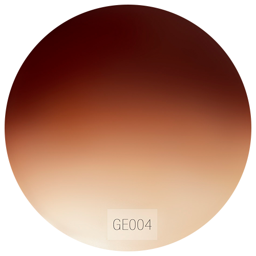 GE004
GE004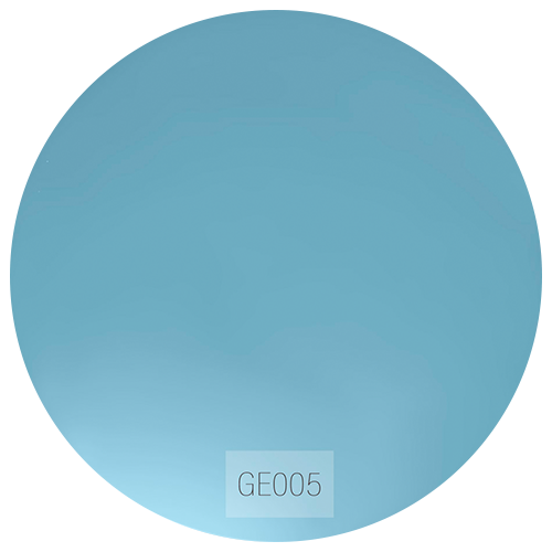 GE005
GE005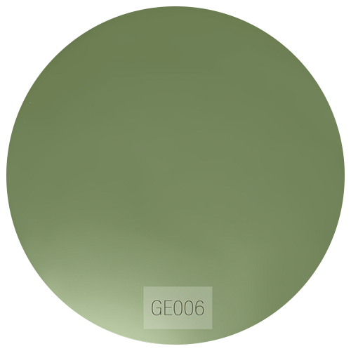 GE006
GE006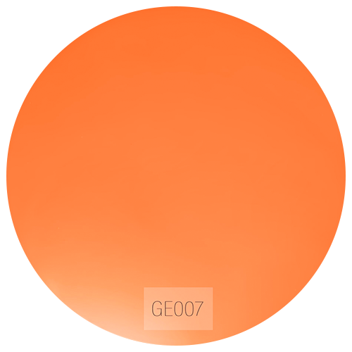 GE007
GE007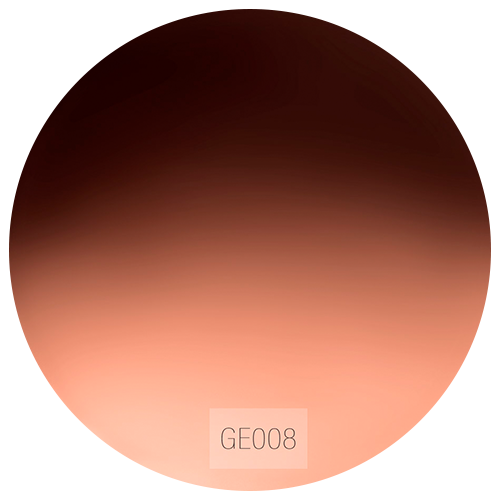 GE008
GE008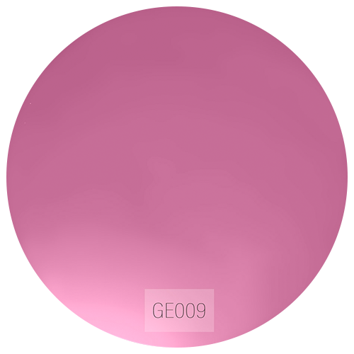 GE009
GE009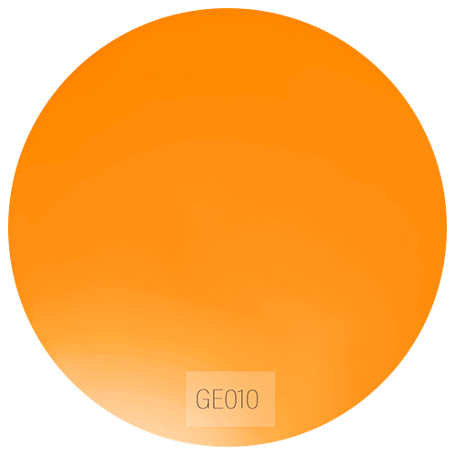 GE010
GE010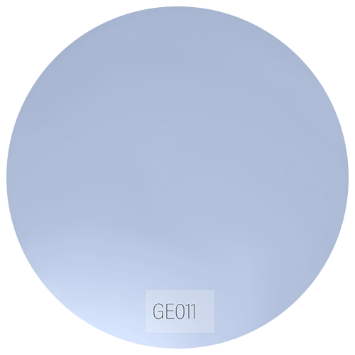 GE011
GE011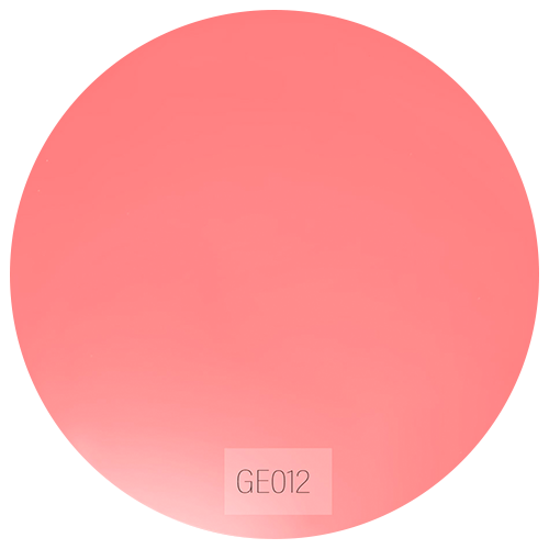 GE012
GE012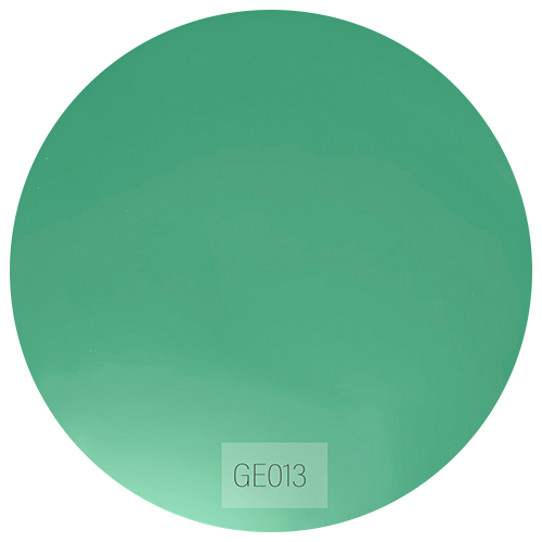 GE013
GE013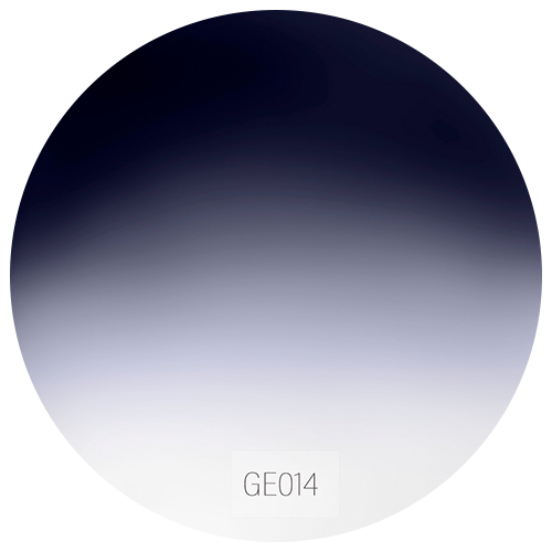 GE014
GE014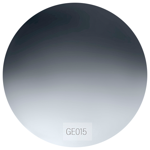 GE015
GE015
Montatura
Frames
Seleziona la montatura desiderata.
Select the desired frame.
-

Helvetica C1
Black/ Crystal GreySilver Soul
-

Helvetica C2
Opaline Orange/ Crystal CoralGolden Soul
-
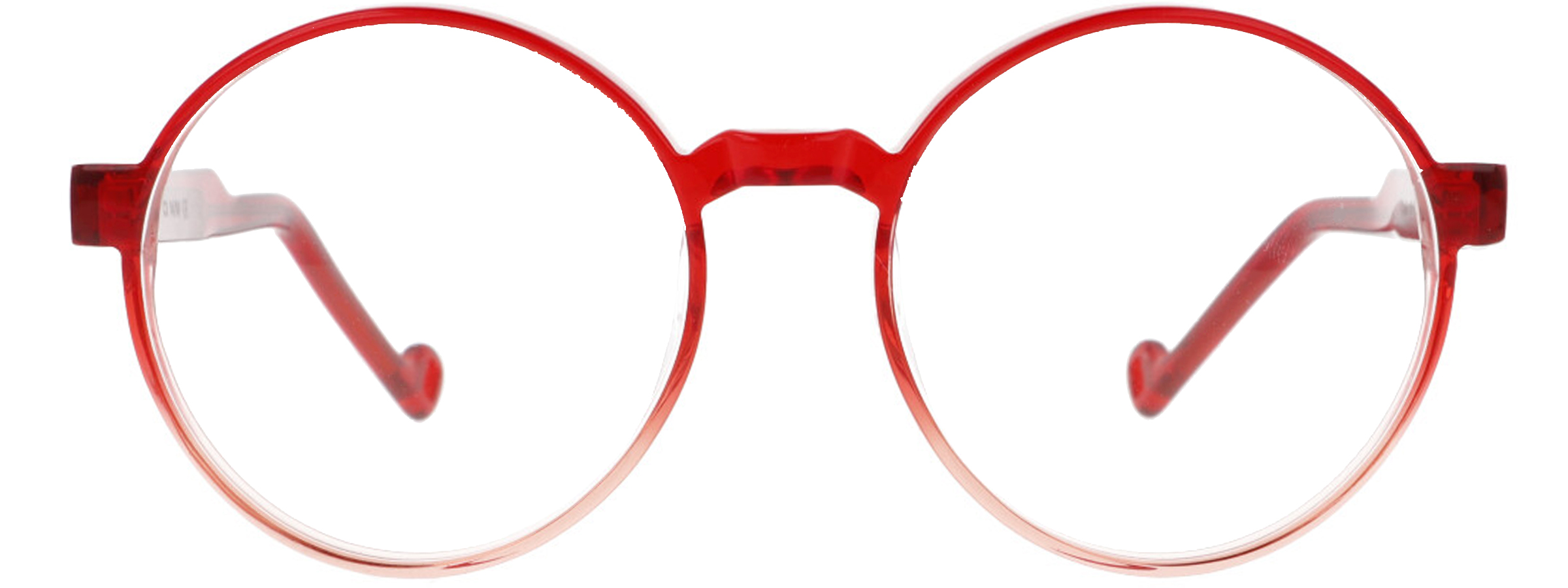
Helvetica C3
Gradient RedSilver soul
-
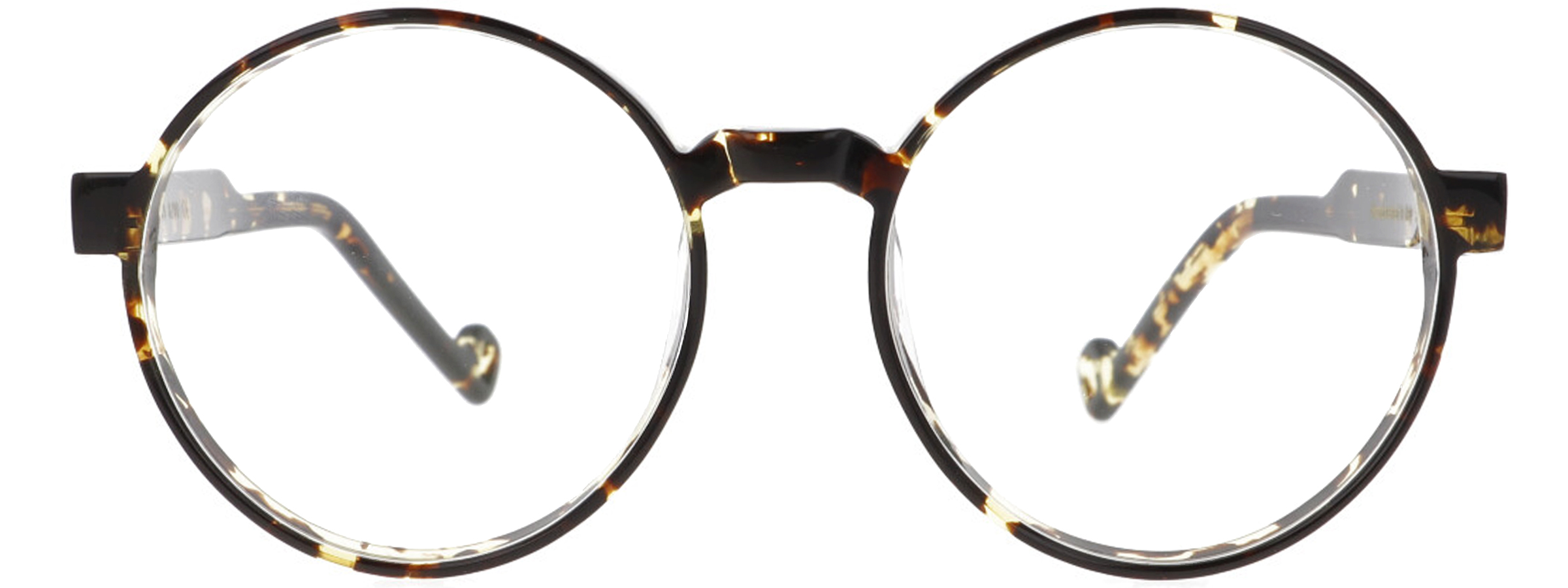
Helvetica C4
Gold TurtleGolden Soul
-
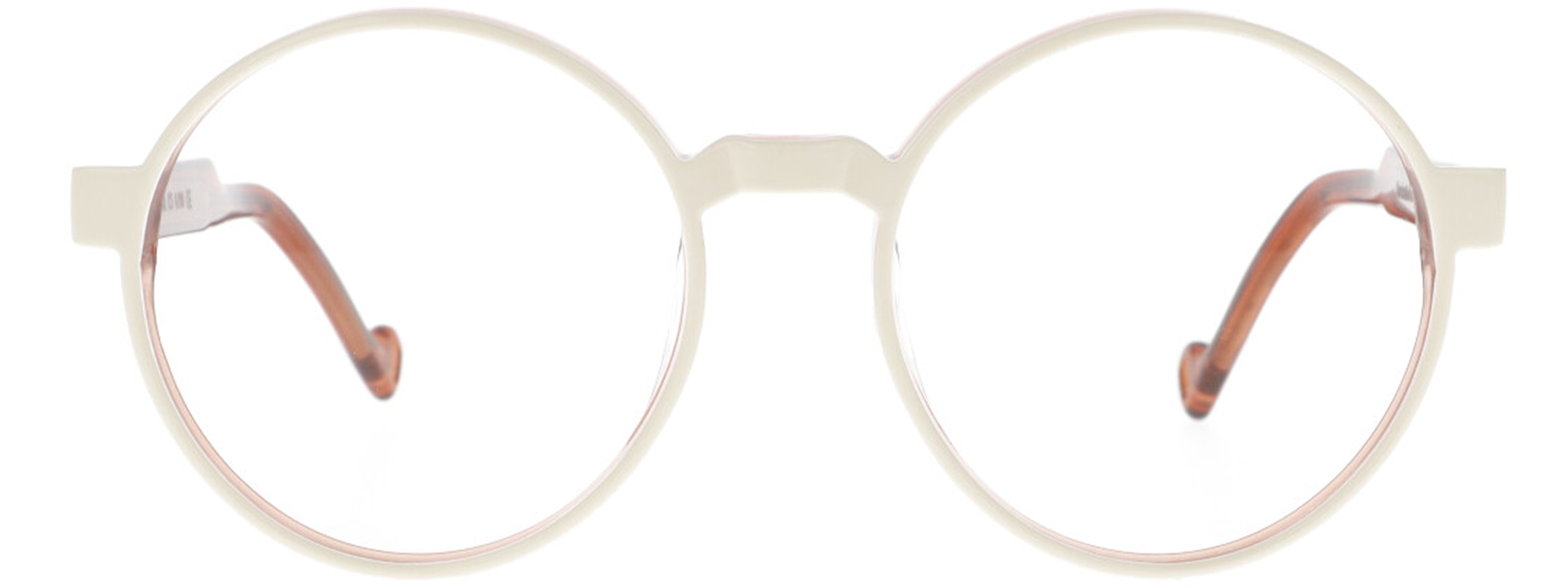
Helvetica C5
Sand/ Crystal ClaySilver Soul
-

Helvetica C6
Sky Blue/ Crystal Traffic RedSilver Soul
-

Helvetica C7
SkydiverGolden Soul